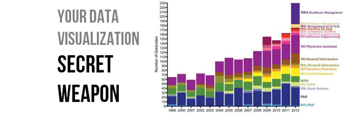
You want to know the trick to fixing most scary data visualizations? The answer to horrifying stuff like this?
What does one do when the graph gives you the shivers?
The answer is always going to be: Small Multiples. Break the graph down into multiple tiny graphs, all on the same scale, arranged in a row or a grid. This way, each piece of the data can stand in it’s own spot of sunshine, where we can see it clearly. It’s a quick way to declutter but beyond that it is the primary method to make sense out of the madness. It’s the secret weapon of interpretability and comprehension. Hat tip to Rob Simmons for sharing a small multiples slopegraph recently. Imagine the insanity if this was all clustered into one graph, as would typically be the case.
Small multiples & slopegraphs https://t.co/dEbj65rQAM new #thumbsupviz cc @AnnKEmery @jschwabish @evergreendata pic.twitter.com/FnCIQUtYix — Rob Simmon (@rsimmon) September 6, 2016
Well, it would look like that bowl of spaghetti up above. Yikes! Small multiples bring clarity.
Just thinking about how this data would look crammed into a single graph makes me cry a little.
How Americans spend their day. #dataviz
Hooray small multiples!https://t.co/1csofUUAgy pic.twitter.com/fxKcutq62B
— Randy Olson (@randal_olson) September 9, 2016
So keep small multiples in your backpocket, right next to your boomerang and your ninja star, because it rescues crazy visuals. It is how you swoop in to save the day when your boss is frustrated because she’s tried a few different graph types and they are all overly complicated. It’s how you get a raise, Superhero.


